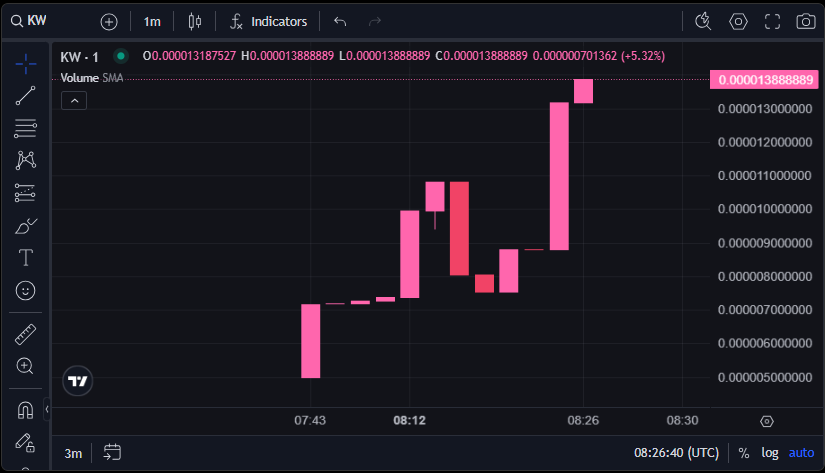
Understanding the Trade Chart
The trade chart on Mew.gg uses an OHLC (Open-High-Low-Close) graph to visually represent the price movements of meme tokens over time. It provides a clear and structured way to analyze the token’s performance in intervals.
 "Create Token" Page
Axes explanation
- X-Axis: Displays time, divided into 15-minute intervals.
- Y-Axis: Represents the price of the meme token in ETH.
Understanding OHLC components
For every 15-minute interval, the chart shows the following details:
- O (Open): The price at the beginning of the interval.
- C (Close): The price at the end of the interval.
- H (High): The highest price reached during the interval.
- L (Low): The lowest price reached during the interval.
Interpreting the colors on the chart
- Pink Bars: Indicate that the price increased during the interval (Close > Open).
- Red Bars: Indicate that the price decreased during the interval (Close < Open).
Price movement insights
- Token Buy: An increase in buying activity pushes the graph upwards.
- Token Sale: An increase in selling activity causes the graph to decline.
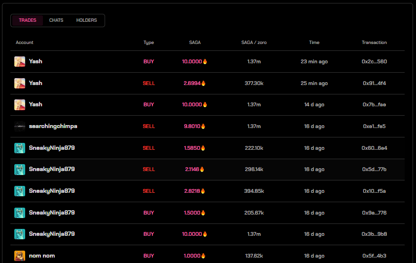 Table that shows each buy and sell for a meme token on mew.gg
This trade chart helps users track token trends and make informed decisions about buying or selling meme tokens on mew.gg.